INTRODUCTION
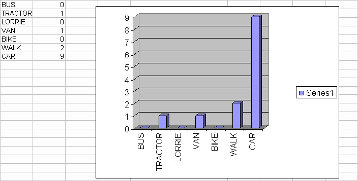
In our tally chart we show how many cars, lorries etc we can see in a short time [10 minutes] At the end of the project we will have a result of the vehicle that is used the most.
To make this a fair test we won't just have like [1 hour] and
then 15 minutes because that wouldn't be a fair test we're
going to have 10 minutes each time [each week].
To make the results easier to understand we are going to make graphs for each tally chart. There used to be an old railway line.
That was a main source of transport, but things have changed now and there are more cars. Here's an example…
